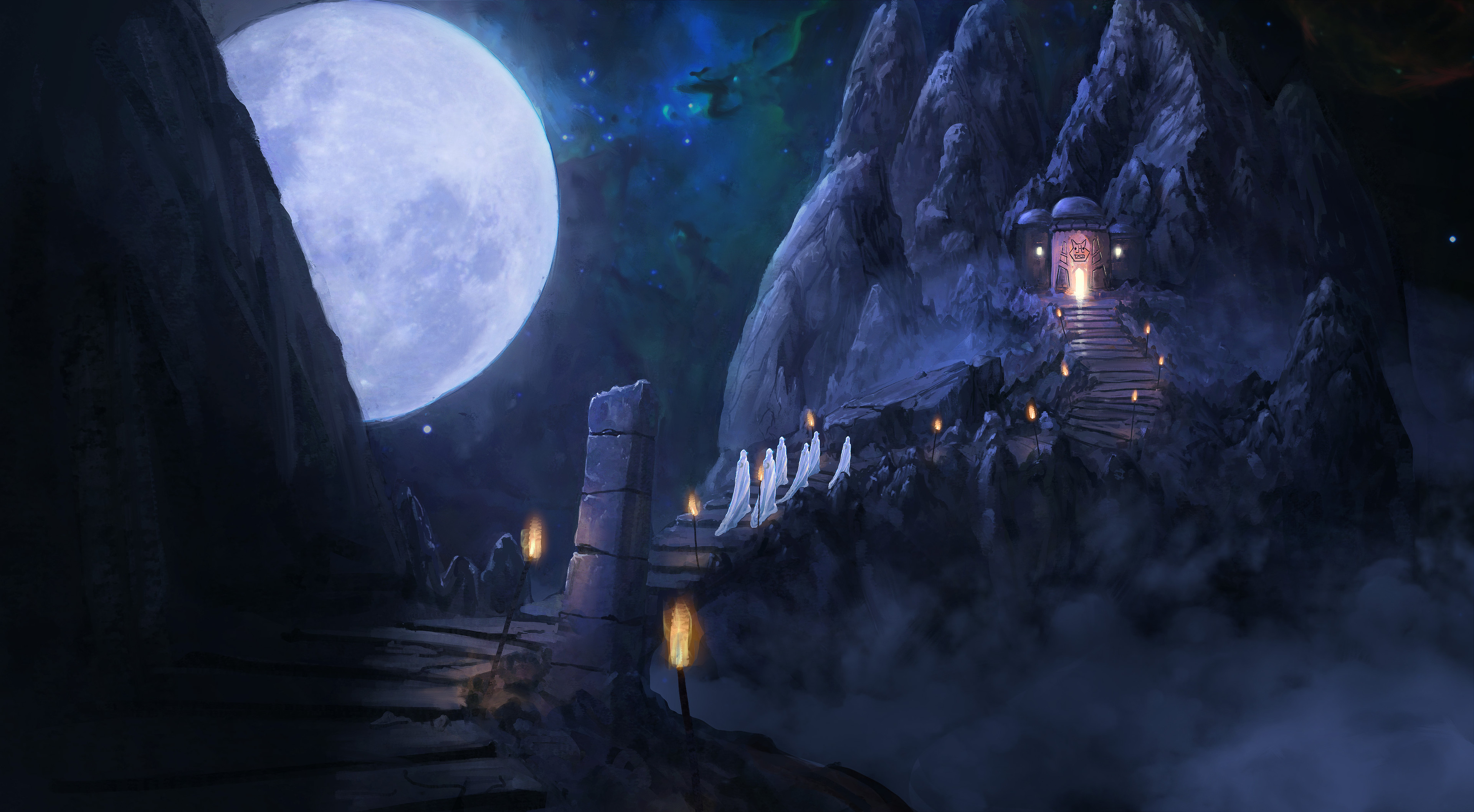
The moon observatory & progress
A personal artwork made with Photoshop CS 5.5 extended in roughly 7 hours.
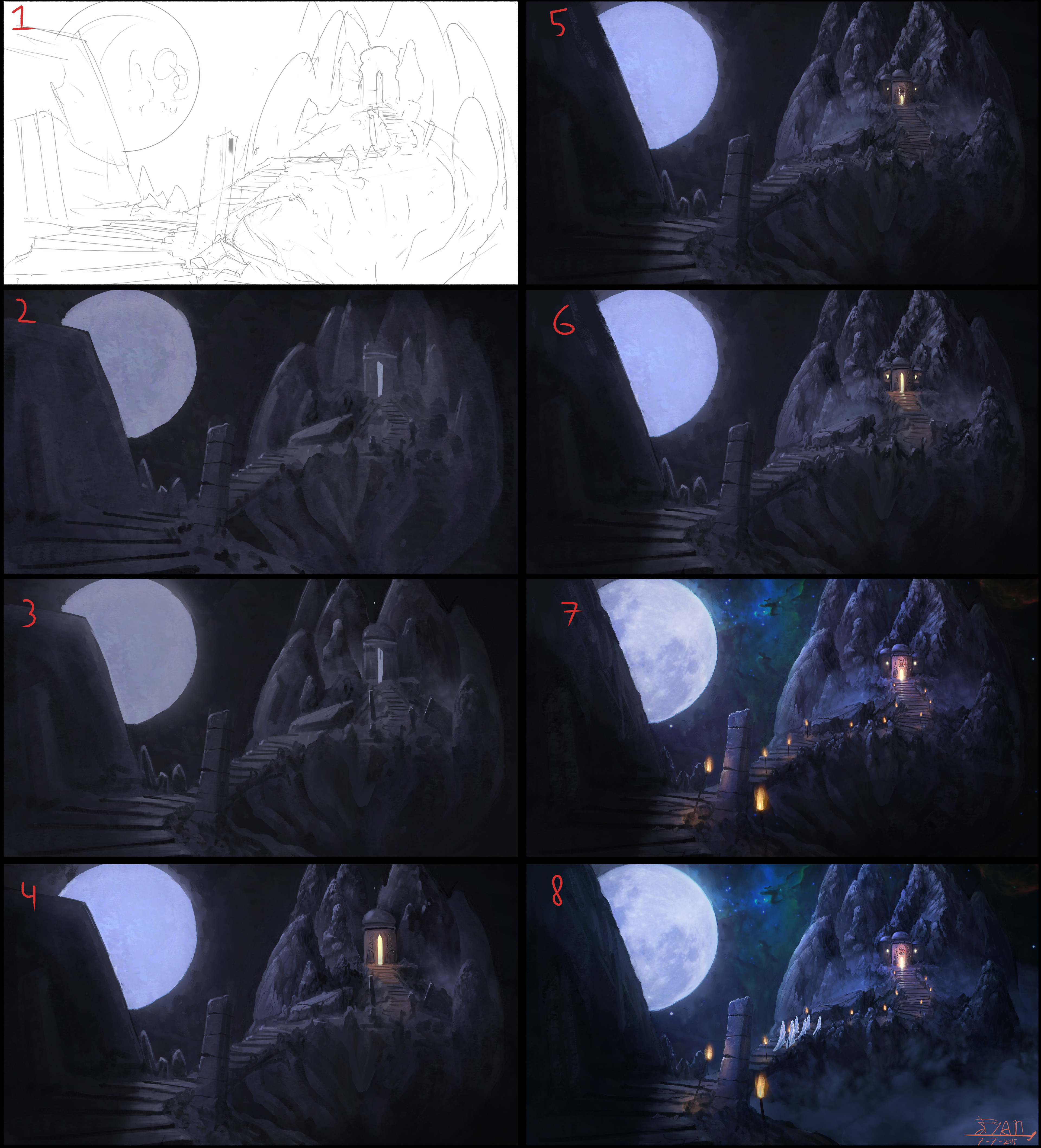
Description for progress:
1 Sketch
I had a rough idea to create a pathway to an altar of some sorts, made with the default round brush at 6 px.
2 Rough color and value
Blocked in the values and very desaturated colors, a big round brush with 'Color dynamics' creates a nice texture.
3 Rough detailing
Painted shadow and light in some area's for variety and trying to avoid using very dark shadows. Those parts are the most crucial at start since they help later on with detailing. By placing patches of light and shadow, you only have to scribble over them to make the faces and shapes more interesting.
4 Introducing color
A few color dodge layers with different opacities and paint which let the purples and orange colors pop out more. Also used lasso tool near the edges of the rocks and painted with darker or lighter color to make distinction between the rocks more apparent.
5 Detailing
More detailing in all area's, mainly with a 20 px chalk brush. Any brush will work, its just a matter of the look and feel. Also notice i made the building in the distance much smaller, still not happy with the design though...
6 Shadow pass and color dodge
Not much different here, changed the look of the building a bit and some overall detailing.
7 Background texture & More detailing
Color dodge jumps to the rescue and pops out the colors and the saturation. Along with the background, which consist of 2 nebulae photo's i painted over. Some further detailing here and there. I knew i missed something, so i tried to improve the color balance by adding more orange and yellow to the scene via fire torches. Of and i rendered the foreground some more, now it's already much more appealing!
8 Finishing touches
Which environment doesn't have an ordinary guy to show the scale and story of the scene? Well to make it more interesting i added 6 nice guys with robes to show the scale and add a bit of narrative. Since i was bothered by that stupid almost black bottom right corner, i added some clouds. Now this change which made me realize 'This is it!!' even though the sketch showed a floating island of some sorts. So the big thing i learned today, you don't have to stay with the sketch or idea to make something even more interesting!

